The Styles tab allows you to customize the look of your app by choosing settings and colors for various elements including the action bar. If you'd like to make changes to your style choices, you can always return to this area and edit your selections.
App Colors
Note: These colors do not affect Website, Custom Page, or HTML Archive content. Some application elements may contain their own color settings which override these settings.
Backgrounds
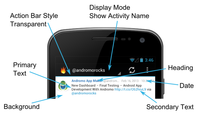
The color that will be used as the background in your app for areas that don't contain their own color settings. For example, this color is used as the background color of the RSS feed item list (see example image below).
Headings
The color that will be used for any heading text in your app for areas that don't contain their own color settings. For example, this color is used as the heading text for an RSS feed item (see example image below).
Primary Text
The color that will be used for any body text in your app for areas that don't contain their own color settings. For example, this color is used for an RSS feed item's text (see example image below).
Secondary Text
The color that will be used for any text elements that require a secondary text style in your app for areas that don't contain their own color settings.
Dates
The color that will be used for any dates in your app that don't contain their own color settings. For example, this color is used for the dates of an RSS feed item (see example image below).
Action Bar
Action Bar Theme
When choosing a theme, you should choose Light or Light with Dark Action Bar if you plan to pick bright background colors, otherwise you should choose Dark. The base theme is used for tons of little bits in your app as well as the colors in the action bar, so you don't have to select them all yourself. Choose from the following options:
- Light - The Light Android system theme. Choose this theme if you're using bright background colors and want a light grey action bar and menu, with black text.
- Dark - The Dark Android system theme. This theme uses a black action bar and menu, with white text.
- Light with Dark Action Bar - A combination of the Light and Dark system themes. This theme contains light elements for things like backgrounds, but displays a dark action bar.
- Upload Custom Theme File - This option allows you to upload a custom theme file instead of using the default Light or Dark themes. You can create this file using the Android Action Bar Style Generator. Andromo requires that "Sherlock" be selected for it's "Style compatibility" setting. For more information about creating the style file, see the Action Bar Style Generator knowledge base article.
Action Bar Style
The style of the action bar when using one of the default system themes - Light, Dark, or Light with Dark Action Bar.
Note: If you're using a custom theme file, the equivalent setting is defined as the "Action bar style" when creating it.
- Solid - Shows a solid action bar.
- Transparent- Shows a transparent style action bar. This option looks similar to solid, but displays a colored key line.
Action Bar Mode
The text mode to display on the action bar. Choose from:
- No text or activity navigation - Shows no application or activity title text on the action bar. This option does not contain a navigation dropdown.
- Show application name (no navigation) - Shows the application name title text on the action bar for the dashboard, and all activities. This option does not contain a navigation dropdown.
- Show activity name (full navigation) - Shows the application or activity name title text on the action bar. This option includes the navigation dropdown.
Override theme colors
Enabling this setting allows you to set the text color shown in the action bar.
Action Bar Logo Image
Show a logo image in the action bar instead of the application icon. To maintain compatibility between various screen sizes, we recommend a maximum width of 550 pixels (when not showing action bar text), and a general height of 60 pixels. The image will scale to fit the height of the action bar, so you can experiment with other sizes to suit your logo, and desired title text visibility.